Heatmaps of housing outcomes
Our heatmaps of housing outcomes offer a high-level overview of the housing situation across Aotearoa New Zealand, showing how towns and cities are performing relative to each other and other specific benchmarks.
We no longer publish updates for this report.
How to use the heatmaps
The heatmaps should be used as a starting point for further analysis, alongside other information, such as local context, knowledge and relationships. Used alone, they can’t help to make decisions about what needs to be done, or where and how it needs to happen.
The heatmaps compare places based on measures of:
- severe housing deprivation, which includes rough sleeping, overcrowding and temporary accommodation
- rental stress
- home ownership affordability.
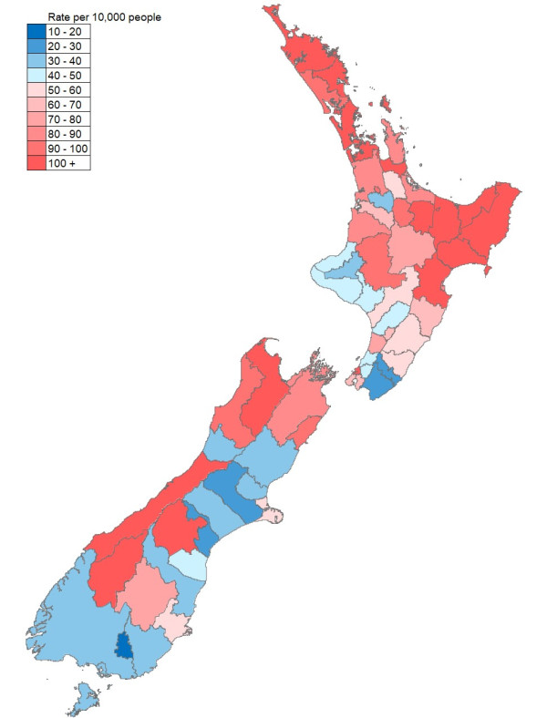
Rate of severe housing deprivation per 10,000 people
This map illustrates the proportion of people experiencing severe housing deprivation by city or district council.
Areas in red shades have higher proportions of deprivation and areas in blue shades show have lower proportions of deprivation. Data is from Census 2018.
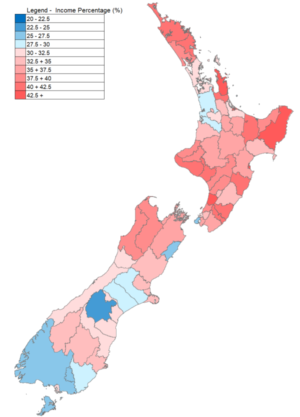
Percentage of the median household income required to afford a median market rent
This map illustrates what proportion of the median household income would need to be spent in different city or district councils to afford a median-priced rental.
The median household income is based on a variety of sources provided by Statistics New Zealand. Market rent is based on the cost of recently lodged rental bonds, rather than the full rental stock.
This chart is based on an experimental data series used to indicate rent stress. Because of the experimental nature of these statistics there will be differences between the median rent and sales price calculated by Te Tūāpapa Kura Kāinga – Ministry of Housing and Urban Development (HUD) and other published sources.
Red shades indicate lower levels of affordability, and blue shades higher. Data is from June 2023.
-
Data Table: Percentage of the median household income required to afford a median market rent
Territorial Authority Name
Percentage of the median household income required to afford a median market rent
Far North District
40.8
Whangarei District
41.9
Kaipara District
40
Thames-Coromandel District
48.7
Hauraki District
41.7
Waikato District
28.2
Matamata-Piako District
33.1
Hamilton City
32.7
Waipa District
32.1
Otorohanga District
29.2
South Waikato District
37
Waitomo District
34.8
Taupo District
35.3
Western Bay of Plenty District
31.4
Tauranga City
43.3
Rotorua District
36.9
Whakatane District
42
Kawerau District
54.6
Opotiki District
37.8
Gisborne District
43.7
Wairoa District
33.6
Hastings District
36.8
Napier City
45
Central Hawke's Bay District
40.5
New Plymouth District
39.2
Stratford District
39.3
South Taranaki District
41
Ruapehu District
36.3
Wanganui District
42.4
Rangitikei District
38.9
Manawatu District
38.6
Palmerston North City
35
Tararua District
33.3
Horowhenua District
46.4
Kapiti Coast District
39.4
Porirua City
32.1
Upper Hutt City
33.9
Lower Hutt City
35.3
Wellington City
25.5
Masterton District
40.2
Carterton District
40.4
South Wairarapa District
36.7
Tasman District
39.9
Nelson City
37
Marlborough District
36
Kaikoura District
26.4
Buller District
38.8
Grey District
32.3
Westland District
30.5
Hurunui District
34.9
Waimakariri District
33.7
Christchurch City
32.9
Selwyn District
28.3
Ashburton District
27.8
Timaru District
30.1
Mackenzie District
22.7
Waimate District
30
Waitaki District
32.2
Central Otago District
32.9
Queenstown-Lakes District
33.5
Dunedin City
34.2
Clutha District
28.2
Southland District
26.4
Gore District
26.5
Invercargill City
31.1
Auckland
31.4
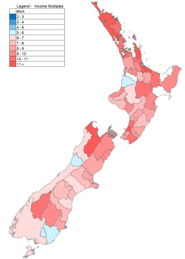
Number of years of savings on the median household income to purchase a median-priced house
This map illustrates how many times the annual median household income a median priced house would cost in different territorial authorities.
This chart is based on an experimental data series used to indicate purchase affordability. It uses data from a variety of Statistics New Zealand sources, as well as house sale price data from CoreLogic.
Because of the experimental nature of these statistics there will be differences between the median rent and sales price calculated by HUD and other published sources.
Red shades indicate lower levels of affordability, and blue shades higher. Data is from June 2023.
-
Data Table: Number of years of savings on the median household income to purchase a median-priced house
Territorial Authority Name
Number of Years of Household Median Income to Purchase Median Price House
Far North District
12.9
Whangarei District
10.5
Kaipara District
11.4
Thames-Coromandel District
15.4
Hauraki District
10.4
Waikato District
8.5
Matamata-Piako District
9.3
Hamilton City
10
Waipa District
9.7
Otorohanga District
0
South Waikato District
7.1
Waitomo District
5.9
Taupo District
10.3
Western Bay of Plenty District
11.2
Tauranga City
11.9
Rotorua District
8.4
Whakatane District
10.5
Kawerau District
9.5
Opotiki District
0
Gisborne District
9.4
Wairoa District
0
Hastings District
9.4
Napier City
10.7
Central Hawke's Bay District
8.7
New Plymouth District
9.1
Stratford District
7.6
South Taranaki District
7.2
Ruapehu District
6.6
Wanganui District
9.2
Rangitikei District
7.7
Manawatu District
8.2
Palmerston North City
8.5
Tararua District
7.4
Horowhenua District
10.2
Kapiti Coast District
11.1
Porirua City
8.3
Upper Hutt City
8.2
Lower Hutt City
8.6
Wellington City
7.7
Masterton District
8.9
Carterton District
8.7
South Wairarapa District
10.9
Tasman District
11.4
Nelson City
10.4
Marlborough District
9.3
Kaikoura District
9
Buller District
6.4
Grey District
5.9
Westland District
6.3
Hurunui District
8.5
Waimakariri District
8.4
Christchurch City
8.4
Selwyn District
7.4
Ashburton District
6.4
Timaru District
7
Mackenzie District
7.5
Waimate District
6.2
Waitaki District
7.5
Central Otago District
9.3
Queenstown-Lakes District
10.8
Dunedin City
8.8
Clutha District
5.5
Southland District
6
Gore District
5.7
Invercargill City
6.5
Auckland
10.6